
 (470) 713-8211


Everyone loves setting money on fire, right? That is essentially what you do when your site leaks traffic. American Ecommerce Hub presents this guide to stopping the bleeding.
If your store suffers from low sales despite decent traffic, your technical setup is likely failing users.
Stop guessing and start fixing the structural errors bleeding your profit margins dry. We do not deal in fluff here. We deal in hard metrics and user behavior.
The following points cover the exact mechanics required to turn passive browsers into paying customers.
Follow these rules to harden your store, tighten your funnels, and capture the revenue you currently leave on the table. Welcome to the baseline for serious business growth.
In this blog from American Ecommerce Hub, we will be exploring 12 straightforward yet effective strategies to enhance your eCommerce conversion rate optimization.
1. Improve Product Page Clarity with Better Structure and Content
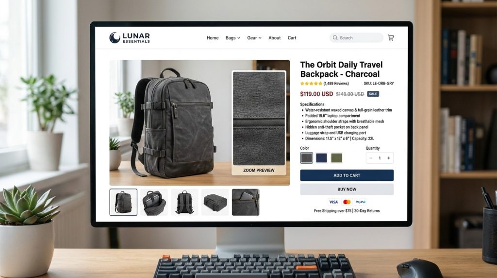
Your product page serves as your top salesperson. Do not make users guess what the item does. Place clear heading tags near the top of the content.
Use bullet points for specifications to keep the layout clean. Keep the description focused on user benefits rather than just dry specs. High-quality images are mandatory for any serious store.
Zoom functionality helps users inspect materials before committing to a purchase. Write unique copy for every single item in your store. Search engines hate duplicate content.
If you copy vendor descriptions, you lose ranking potential. Ensure the price appears clearly near the add to cart button.
A cluttered page scares away buyers. Test different layouts to see which one converts better.
2. Reduce Friction in Checkout Flow with Practical UX Changes
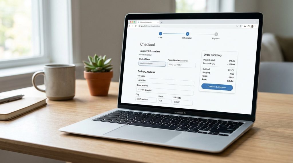
Users hate long forms. Every extra field kills conversion chances. Ask only for the necessary information, such as shipping address and payment method.
Guest checkout prevents the friction of account creation. Require account setup only after the order completes, pre-fill fields where possible using browser data.
Use progress bars to show steps remaining in the process.
Remove distracting navigation menus during checkout. Focus the user on finishing the transaction.
Speed matters here more than anywhere else. If the page loads slowly, the user leaves. Test your checkout on different browsers to ensure compatibility.
Verify that the mobile view works perfectly. Friction remains the enemy of profit. Remove every single barrier standing between your customer and payment to increase your success rate.
3. Use Faster Site Performance to Lower Bounce and Lift Conversions
Slow websites kill revenue. Google tracks core web vitals and ranks faster pages higher. Compress every image before uploading to keep file sizes low. Use modern formats for better quality at smaller sizes.
Enable browser caching to serve returning visitors faster.
Minify your CSS and JavaScript files to reduce their load weight. Use a content delivery network to serve assets from local servers.
This reduces latency significantly. Remove unused plugins to reduce code bloat. Check your server response time often.
If your site takes more than 3 seconds to load, you lose massive amounts of traffic. Speed serves as a competitive advantage.
Keep your technical stack clean and lean. Monitor performance daily to spot issues before they ruin your sales figures.
4. Add Trust Signals That Matter Including Reviews and Returns
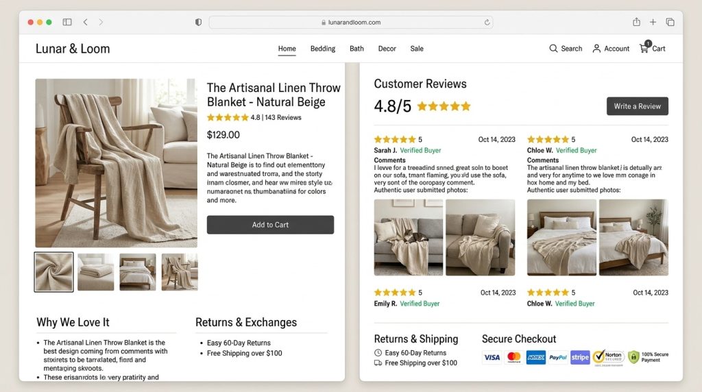
Strangers fear buying online. You must build confidence. Show real reviews with photos if possible. Display trust badges from known security providers in the footer.
Create a clear return policy that is easy to find. Link it near the cart button. Answer questions about shipping times and costs before they ask. Use professional photos for every product.
Low-quality images make your brand look suspicious. Answer emails quickly to prove you exist. Include a physical address and phone number on your contact page.
People want assurance that they can reach you if problems arise. Build authority through transparency.
Never hide your business policies. Put them where the user makes the buying choice. Trust allows the user to feel safe spending their money.
5. Optimize Mobile Shopping for Real User Behavior
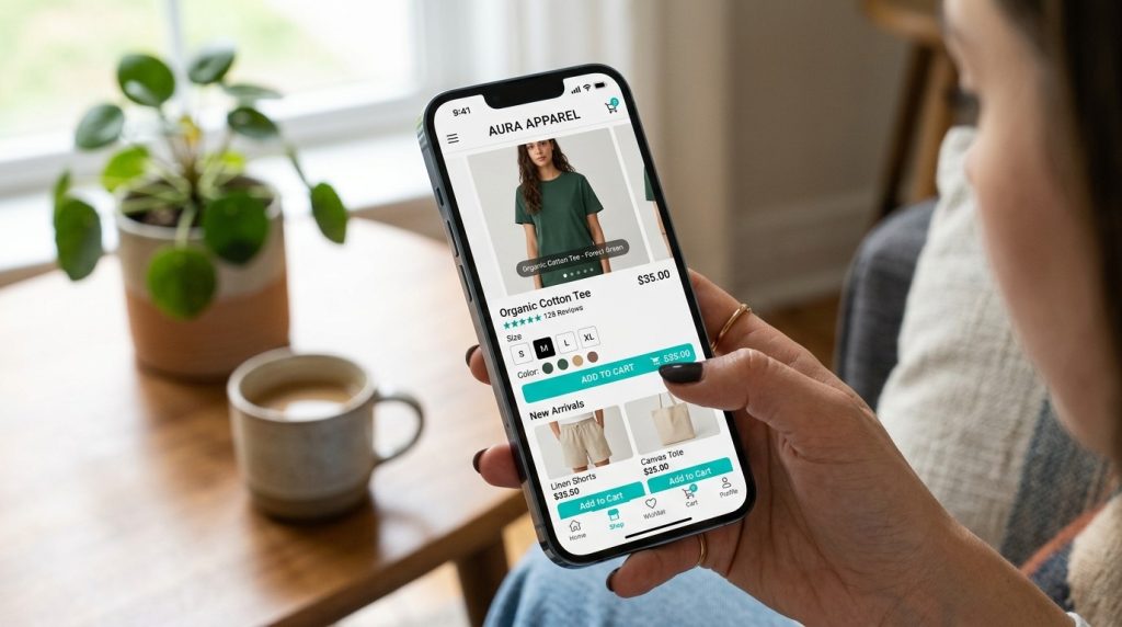
Most users shop on phones today. Design your site for small screens first. Avoid tiny buttons that require precision clicking. Use large touch targets that work with thumbs. Ensure text size remains readable without zooming.
Use a sticky add-to-cart button that stays on-screen as you scroll. Test your checkout on actual mobile devices instead of just browser simulators.
Check that pop-ups do not block the entire screen. Hide secondary information behind tabs or accordions to save space. Mobile users want speed and convenience.
If they have to pinch and zoom, they leave. Simplify the navigation menu. Focus on making the primary task of buying as simple as possible.
Your mobile experience dictates your total sales volume.
6. Simplify Pricing and Shipping Information to Avoid Surprises
Surprises destroy trust. Nobody likes adding an item to the cart only to see shipping fees double the price later. Show total costs early. Offer free shipping if possible.
If you must charge fees, be upfront about the total price on the product page. Use a shipping calculator if zones affect rates. Transparency helps user decision-making.
If customers feel they’ve been tricked, they abandon their cart and never return. Be honest about delivery times. Manage expectations by giving accurate dates.
Do not bury fine print about restocking fees. Keep pricing structures simple. If your price tiers confuse buyers, they leave.
Clarity leads to sales. Help the user trust your checkout process. Honesty creates long-term customers who return to buy again.
7. Improve Call to Action Placement Using Data Driven Testing
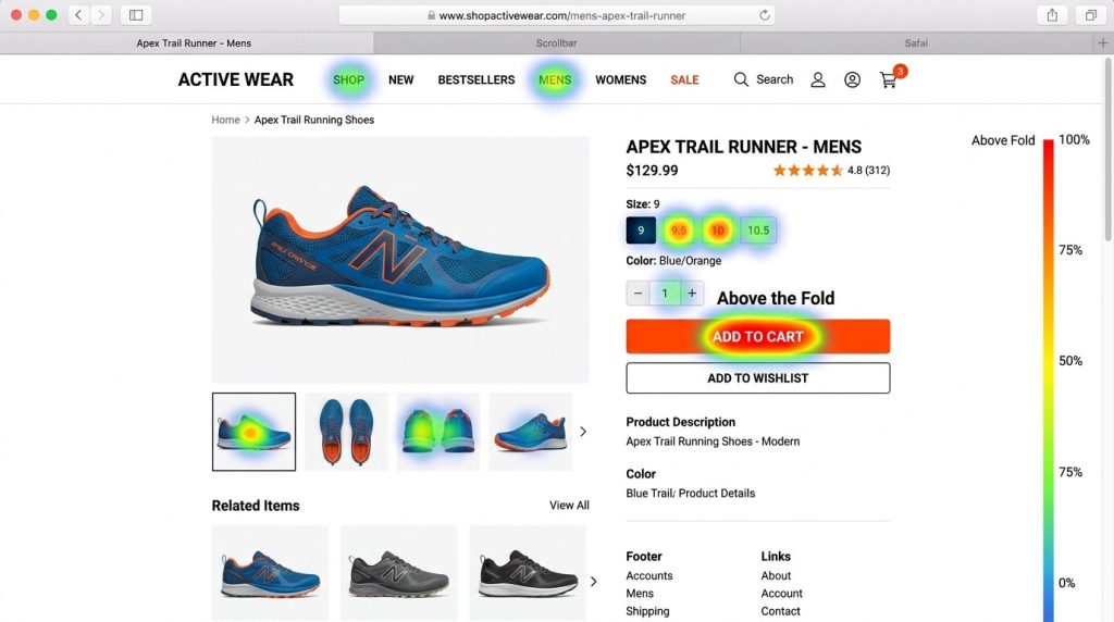
You need clear buttons that demand action. Use colors that contrast with your background. If your site is white, use a bright blue or orange for the add-to-cart button.
Make sure the text clearly states the action, such as ‘buy now’ or ‘add to cart’. Test different button sizes to see what draws the eye. Heatmap software shows where users scroll and click.
Place your primary button above the fold. Do not make users hunt for the checkout path. Repeat the call to action at the bottom of the page for long descriptions.
Give users a clear path forward. Test every variation to see what gets clicks. Data proves which layout works best for your specific audience.
8. Use Smart Personalization Without Complexity
Show users items that match their taste. Use browsing history to suggest related products. If someone looks at running shoes, show them matching socks or insoles.
Do not use generic recommendations that ignore user behavior. Keep it relevant. Use cookies to remember what they viewed. Display a bar of recently viewed items so they can jump back to previous pages. Tailored experiences keep users engaged.
If you suggest items they actually want, they buy more. Keep the logic simple. Do not overwhelm the screen with too many offers. Just show what matters.
This keeps the focus on the current purchase while nudging toward additional items that add value. Relevant suggestions turn single-item shoppers into bigger basket earners.
9. Measure the Funnel Step by Step to Find and Fix Conversion Drop Off
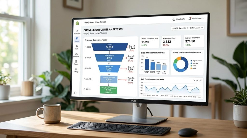
You cannot improve what you do not track. Map the journey from arrival to purchase. Use analytics tools to find where users leave the site.
Do they drop off at the cart page? Maybe your shipping form breaks on mobile. Look for high exit rates on specific pages.
Fix these bottlenecks immediately. Check your funnel health weekly. A broken form field kills sales instantly.
Monitor your checkout pipeline like a hawk. If the data shows a sudden drop at a specific step, you have found a technical error or a bad user experience design.
Fix it fast. Data gives you the map to higher profits. Use this information to clean up your sales path and remove every roadblock.
10. Leverage Post-Purchase Communication to Drive Repeat Business
The sale does not end when they pay. Send a receipt immediately. Send shipping updates without the customer having to ask. Use transactional emails to suggest complementary products.
Ask for reviews after they receive the item. This builds social proof for future buyers. Reach out with loyalty rewards if they buy often.
Repeat business costs less than acquiring new users. Keep the relationship alive with helpful tips on how to use their purchase.
This encourages them to come back when they need more. Build a community around your brand. A happy customer shares your store with friends.
Treat every post-purchase moment as a chance to win a repeat sale. Keep them engaged so they choose you over competitors.
11. Implement Visual Search and Filter UX to Help Users Find Products
Customers want to find items fast. If they cannot search, they leave. Implement a predictive search bar that suggests products while they type.
Use filters to sort by size, color, or price. Faceted navigation helps users narrow down big categories quickly.
Ensure your search understands common misspellings. If a search yields zero results, show related products instead of a blank page.
The search bar acts as your store clerk. Make it work hard for you. A working search bar keeps traffic on your site longer.
Users who search generally have a higher intent to buy.
Keep the search experience fast and accurate to secure the sale. Finding items should take seconds.
12. Use Exit Intent Strategies to Capture Abandoning Traffic
Traffic that leaves costs money. Use exit-intent technology to capture users before they close the tab. Offer a small discount for their first order or suggest a different product that might appeal to them.
Do not annoy them with aggressive pop-ups that block the screen. Provide real value. A well-placed exit offer can save a sale. Track why users leave.
Maybe your prices are too high, or your shipping options are bad. Use exit-intent data to understand your weaknesses.
If you can keep them on site for one more minute, you might close the sale. Test different offers to see what works best. Give them a reason to finish the transaction right now.
Frequently Asked Questions
Conversion rate improvement means turning browsers into buyers. You take your existing traffic and tweak your store so more people finish their checkout.
It matters because you spend money to get visitors to your site. If they leave without buying, you lose that cash. Better rates mean higher profit margins.
Cut your page load times right now. Delete heavy scripts that slow down mobile users. Remove extra fields from your checkout forms. Add clear buttons that stand out.
Test these changes on your highest traffic pages first. Fast results come from removing friction rather than adding complex new features.
Place your call-to-action buttons above the fold. Use high-resolution photos that show the product from every angle. Add trust badges to reassure nervous buyers.
Simplify your navigation so users find products fast. Display your shipping costs early. Never hide fees until the very last checkout step.
You likely have technical roadblocks or lack trust. Users abandon carts when sites load slowly or mobile layouts break.
If your product pages confuse buyers or your shipping costs shock them at checkout, they leave. Check your analytics. See where users drop off and fix those specific broken steps.
Bad design kills sales. If users cannot find the add to cart button, they cannot buy. Cluttered layouts distract customers from the goal.
Clean designs guide the eye straight to the product benefits. Your design must serve the user intent. Make buying the easiest task on the entire page.
Use heatmap software to see where users click. Analytics tools track where visitors drop off in your funnel. Testing platforms let you compare two versions of a page to see which performs better.
Page speed testers help you find and fix slow elements that cause users to bounce fast.
Your product page sits at the end of the sales funnel. Clear copy and great images sell the item. When you lay out information logically, users get the answers they need to trust your offer.
Remove all distractions. Focus the entire page on a single goal: adding to the cart.
Forcing account creation before checkout stops many sales. Hiding shipping costs until the end ruins trust. Using slow, uncompressed images bores visitors.
Ignoring mobile users creates a broken experience for most of your traffic. Never assume your site works well. Test every single step of your buying path often.
Focus on your existing visitors to grow revenue. Suggest complementary products at checkout to increase order value. Send targeted emails to people who abandoned their carts with a clear offer.
Speed up your pages to keep users engaged. Turn every current visitor into a buyer instead of buying new ads.
Fixing broken links or slow page speeds brings fast wins within weeks. Major testing requires more time to gather enough data for proof. High-volume stores find answers faster than smaller ones.
Expect one to three months for consistent growth trends to emerge as you refine your site strategy.
Conclusion
American Ecommerce Hub provides these strategies to help you turn browsers into buyers. You possess the tools to fix your site and drive growth. Apply these tactics to your store right now to improve your eCommerce conversion rate optimization.
Stop leaking revenue today. Start testing your pages and watching your sales climb. Your business deserves better results than you currently get. Take control and win.